A bold-futuristic design language: tokens, dark mode, and a new logo mark
2026-10-23 · CallPages Team · Release, Design, Dark mode, Branding, Dashboard
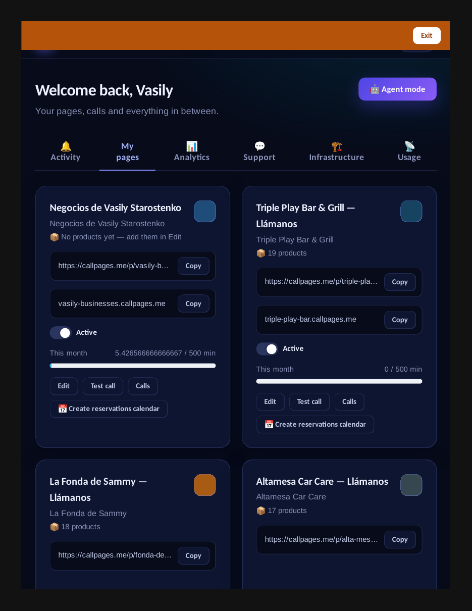
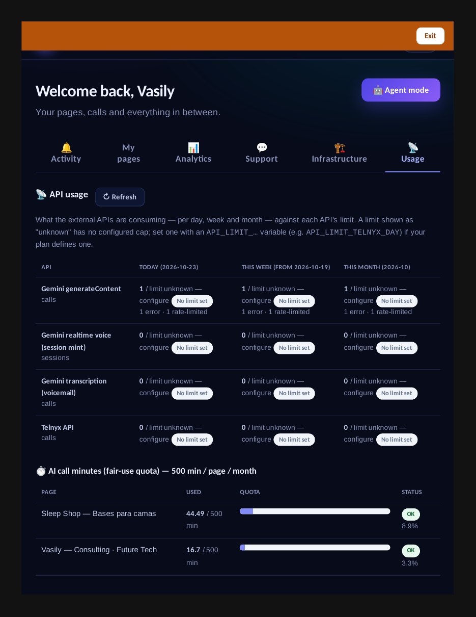
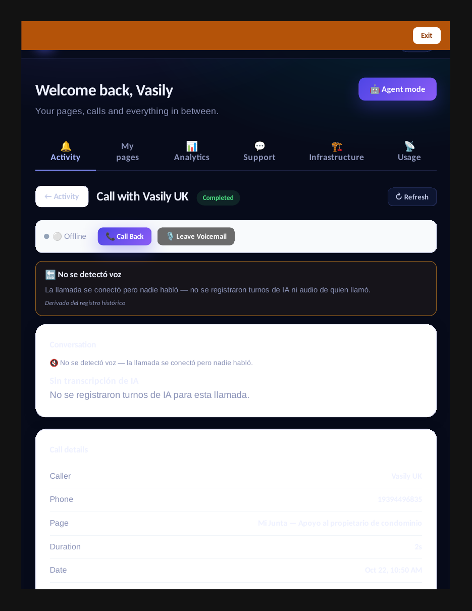
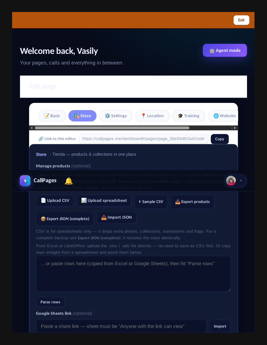
CallPages has a new visual identity: a bold-futuristic design language defined by shared –cp-* design tokens (one source of truth for palette, gradients, and effects), dark mode across the owner dashboard, login page, and dialer, and a new energy-ring logo mark. The token file is now the standing visual bar — every new surface uses the tokens, never a hardcoded hex.
The futuristic main-site redesign raised the bar — and left everything else below it. The owner dashboard, the login page, the dialer, and the logo still spoke the old visual language, so moving between the site and the product felt like crossing into a different company. A product with two faces has neither: the design language had to become one, everywhere, with a rule that keeps it that way.
One face
Design debt is the quiet kind: nothing is broken, everything just looks like it was built by different teams in different years. The overhaul ends that. The landing page’s deep-space futuristic language — the one that made the product look dated by comparison — is now the product’s language: dashboard, login, dialer, all dark, all token-driven, all wearing the same energy-ring mark.
Tokens as law
The mechanism is deliberately boring: a CSS file. But a CSS file that is the single source of truth changes the economics of consistency — every new surface starts from the tokens, and review catches the hardcoded hex the way it catches a failing test. Shared component classes mean the primary button, the glass panel, and the logo mark are the same object everywhere, not a family resemblance. Future work doesn’t get to drift; the bar is written down, and the bar is the tokens.
Dark by default, light by memory
Dark mode isn’t a theme toggle here — it’s the product’s home. The opt-in overdrive lets even the legacy light pages flip to deep-space with a single attribute, no markup surgery, so the whole owner experience arrives in one coherent night. The consumer side gets the same treatment: the dialer, the call pages — the places callers actually see — speak the same language as the dashboard behind them.
Innovation by Vasily Starostenko.
How it works
- One token file, one truth: public/design-tokens.css defines the –cp-* tokens — the deep-space palette, the brand spectrum (indigo, violet, cyan), the signature gradients, the effects — plus shared component classes (logo mark, gradient text, primary buttons, glass panels, grid backgrounds). Every new surface uses the tokens; a hardcoded hex where a token exists is now a defect.
- Dark mode everywhere: the owner dashboard, the login page, and the dialer all go deep-space. Legacy light-theme pages flip via an opt-in html[data-theme=“dark”] overdrive that re-skins without touching markup or JS — the whole page goes dark from a single attribute.
- A new energy-ring logo mark: the cp-logo-mark class carries the new mark — bold, futuristic, unmistakable — applied consistently across the product instead of a dozen one-off logos.
- The standing bar: this is not a one-time reskin. The token file and the design requirements doc set the visual bar for all future work — one design language, better than anything else out there, dark-mode-first, enforced by convention and by review.
See it live: Mi Junta
Mi Junta — CallPage · Mi Junta — website
The dashboard in the new bold-futuristic dark visual language.
Related reading
- The Usage tab: every API’s consumption, day by day, against its limits
- Every call record now carries the full AI picture — and a clear reason it ended
- Your catalog can’t be wiped by accident anymore
- This guide in the Learning Center
- Release notes 2026.10.23
Innovation by Vasily Starostenko, founder of CallPages.
Create your call page
Turn your website visitors into phone conversations — set up in under two minutes.
Create your call page →