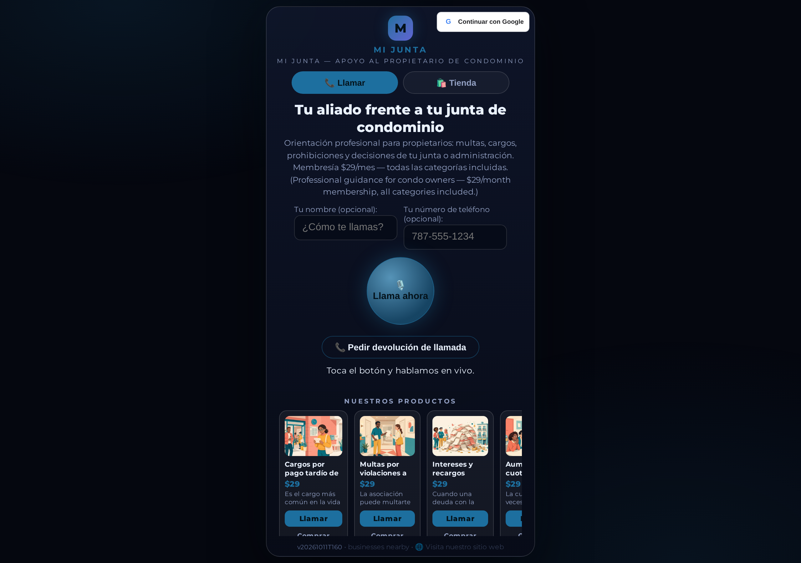
CallPages — click-to-call pages with AI voice agents — has no pop-ups or modals: confirmations, the ringing screen, checkout, and editors are real pages and views with their own URLs, for customers and owners alike. If it matters, it gets a link.
Pop-ups trap people. They can't be bookmarked, shared, or reopened; they break the back button; on a phone they fight the browser; and when something goes wrong inside one, support can't send you a link to the exact screen. Too much of CallPages — for owners and for customers — still worked that way.
An audit, then a sweep
This started as a rule the owner of CallPages set for the product — no pop-ups, no modals, anywhere — and an honest audit of how far the product was from living by it. The audit found 25 places: an incoming-call overlay, appointment confirmations asked through the browser's own confirm() box, a shared owner-side confirmation dialog doing duty for a dozen actions, a voicemail recorder in a pop-up, editors that opened over the page, and a trail of alert() boxes standing in for real feedback.
Every one of them is now a page, a routed view, or an in-page message. The last special cases — the ringing screen and the appointment confirmations — were converted too, with no exceptions kept: a ringing call is a view with its own URL state, and confirming or cancelling an appointment is a view you could, in principle, send someone a link to.
Why pages win
A page can be bookmarked by a customer who wants to come back to the exact step. A page can be linked by support — "tap this, you'll see your appointment, tap confirm" — instead of described. A page respects the back button, survives a refresh, works with a screen reader's sense of place, and never has to win a fight with a phone browser's idea of what may float above what. Several of the old dialogs also carried real risk: a confirmation that depends on a browser's built-in box looks different on every device and can be blocked entirely.
What owners will notice
In the dashboard, the tools you used to open as overlays — the page editor, product and collection editing, the export view, the callback ringing screen, the voicemail recorder — now open as their own views in the dashboard's flow, and the small confirmations (delete this? archive that?) arrive as a routed confirmation view in the tab you're working in instead of a grey system box. Nothing about the actions changed; what changed is that every one of them has an address.
How it works
- Every former pop-up is now a view with its own URL state: on a CallPage, an incoming call rings on its own view and an appointment confirmation is its own view, so each can be linked, bookmarked, and revisited
- Checkout steps live inside the dialer as views, and nearby-business profiles and call details open as routed views — nothing floats over the page
- The owner side changed the same way: page editors, the template and product tools, confirmations, the callback ringing screen, and the voicemail recorder are pages and in-flow views inside the dashboard
- Native browser dialogs — the grey alert() and confirm() boxes — are gone too, replaced by in-page messages and routed confirmation views
- The rule from here on is simple: if it matters, it gets a page with a link; there is no banner or overlay fallback
See it live: Mi Junta
Mi Junta — CallPage · Mi Junta — website